
We’re fans of the block editor in WordPress, aka Gutenberg. Maybe it’s more accurate to say we’re fans of what we know Gutenberg editor will become. It’s the right idea – WordPress needs a drag-and-drop editor that allows users to fully design their site without using code.
However, it’s not quite there yet. The crucial feature it lacks is responsive blocks, which are becoming increasingly vital in today’s mobile-first world. Mobile traffic passed desktop in 2017, well before Gutenberg started, so this isn’t a new requirement.
It’s not a technical issue – every page builder supports different styles for different screen sizes, even the ones that use native WordPress blocks (e.g., Kadence).
So why are responsive WordPress blocks missing, and how do we close the gap?
Why are Responsive Blocks in WordPress important?
Today, very few people are building sites exclusively with Gutenberg.
NASA’s presentation at WCUS 2023 was the keynote. It showed only their internal sites using WordPress and core blocks. It can be done. But that project was the exception that proved the rule—it required tons of custom development and was geared towards a very technical user base—a long way from a traditional website project.
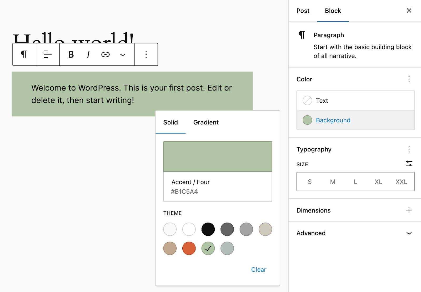
For us at Mindspun, we wanted to add the following inline advertisements to our blog posts. (We wanted to build a slightly more complicated version, but this one illustrates the point.)
Sell Today!
Mindspun Payments is the fastest way to sell digital subscriptions in WordPress. No code required.
This simple banner ad should be straightforward in the block editor, but it wasn’t (and still isn’t). Creating the block itself was effortless on desktop, but it needed to be stacked on mobile so that the image was on top and the text became centered. Building this with only core blocks is all but impossible.

You’ll often hear, ‘We built this with only a handful of lines of CSS,’ which is true, but if you have to revert to coding—and there is a whole lot that goes into knowing which handful of lines to add—then you’ve excluded a large percentage of the WordPress user base.
Plugin developers need responsive blocks.
If you create a plugin that uses blocks (which it should), you’re limited by what core Gutenberg provides.
For instance, Mindspun Payments allows you to build a custom Stripe checkout page entirely with Gutenberg blocks. That page should be responsive if you want users to buy on their phones.
Without responsive core blocks, plugin developers would have to build integrations with every page builder out there—if possible. Then, you’d build a plugin for the respective page builder, not a WordPress plugin.
How are block styles implemented in the WordPress Block Editor?
Understanding how WordPress block styles were implemented is vital in understanding why they aren’t responsive.
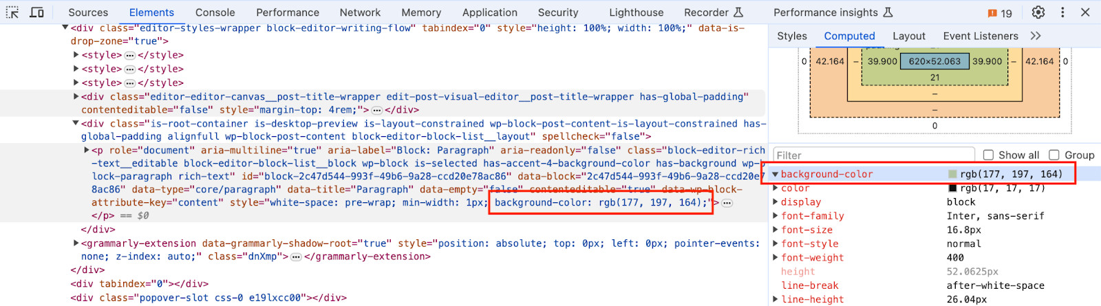
When you add a style to a block, Gutenberg adds an inline style to the HTML tag of the block.
Why weren’t responsive blocks added to WordPress already?
The most common reason is that responsive behavior is the domain of the theme – a throwback to the early WordPress days. The theme should control how blocks change on different screen sizes.
If this is the case, why have block controls if you have to have theme support anyway? Needing theme support contradicts WordPress’s ‘full site editing’ concept, a major development focus.
Another theory is that this approach was a tradeoff to keep blocks static and not require additional PHP code to render them. Static blocks (as opposed to dynamic ones) are stored in the database and rendered as is when needed. That block is then inserted into the page without any additional back-end processing. Of course, PHP is still required to compose the page, but it’s significantly less, equating to substantial performance improvements.
Is this performance improvement worth it, given that it paints us into a corner regarding much-needed functionality? No. Other approaches can deliver the same performance without limitations. More on this below.
If you have a better explanation, tell us on X/Twitter at @getmindspun.
How can core responsive blocks be implemented in WordPress without sacrificing performance?
Block controls need to generate CSS classes that are used by the page. This can’t be avoided – it’s the method provided by HTML/CSS to add media queries.
These generated CSS classes could be added to the page as inline <style> tags in the head of the document or as a stylesheet loaded separately. Given that there should be a relatively small amount of CSS and CSS is only relevant to the current page, inline <style> tags are probably the way to go.
Once we accept this approach, only two more things are needed: connecting the styles to the block and user controls for adding new styles.
Adding CSS to WordPress blocks
Referencing an instance of a block is a harder problem than it may seem. There has to be a way to apply a CSS rule to the block so that no matter what else you do, you don’t break that reference.
For instance, referencing by position doesn’t work because the page will change.
Likewise, using the client ID doesn’t work since it isn’t persistent or stored with the block (by default).
Each block instance needs a persistent ‘block ID.’ The only option for storing such a block ID—at least currently—is a block attribute. When a block is duplicated, care must be taken to regenerate the block ID, but that’s manageable.
There are three main approaches to using the block ID in the HTML/CSS, each with pros and cons. We recommend the first approach: use the block ID as the HTML identifier.
Use the block ID as the id attribute of the HTML element
The block ID is persistent and unique, so I may become the element’s ID.
Pros:
- Simplest to understand
- High specificity means applied styles work much the same way inline styles do.
- If every block has an ID, they can be referenced in the URL via inline anchor tags by adding the ID after the ‘#.’
Cons:
- Block IDs need to be auto-generated so they make ‘ugly’ anchor values.
- You can’t add more human-readable IDs.
- The block editor already adds an id attribute to blocks (which, unfortunately, isn’t persistent)
Use the block ID as a class on the HTML element.
Instead of using the block ID as the id attribute, it could be a class added to the element.
Pros:
- Doesn’t impose a format for the ID.
- More consistent with how styles are generally applied to HTML elements.
Cons:
- Low specificity
The low specificity problem is a big one. If you apply a style to a block, you want that style to work no matter what. Using a class makes it relatively easy for a style from your theme CSS to take precedence over the one added by a single class. The precedence conflict doesn’t happen with IDs because of how CSS applies styles.
Use a block ID in a data attribute on the element
The block ID could be stored in an element data attribute instead.
Something like:
<div data-id=”XXX”>This approach is mentioned for completeness – it has all the same pros and cons as the class-based approach.
Adding Responsive Block Controls to WordPress Blocks.
There has to be some way for users to specify a particular style for a particular block for a particular screen size.
Gutenberg has already done some of the heavy lifting. A button in the upper-right corner allows you to preview on certain screen sizes.
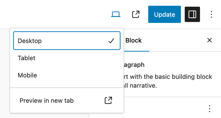
When you click on Tablet or Mobile, an iframe containing your post content is created and scaled to the selected screen size.
All the same Gutenberg issues apply with additional block editor classes being added, but it’s still really helpful.
The only thing missing is a way to specify controls specific to these screen sizes (and optionally add more screen size choices). This is mainly a UX problem that the page builders have solved in various ways. Gutenberg could easily adopt one of these approaches.
The user selections for these controls would also be stored as block attributes.
Add the styles to the WordPress page.
The final step is generating the CSS. Assuming that we use inline <style> tags and the block ID as the element’s ID, it’s just a matter of outputting the style tags when the page is rendered.
The style tags could be generated each time the page is loaded from the block attributes—creating a lightweight dynamic block—or they could be generated when the post is saved and stored as post meta and used as-is.
Both of these approaches are page-cache safe if that option is available.
What’s next? How does this get into Gutenberg?
In the same way all new or experimental features are developed, start with a plugin. So that’s what we did.
Mindspun Responsive Blocks is available for free on wordpress.org. It creates additional blocks that work like core blocks but have responsive controls. There is no pro version; it’s entirely free to use.
We’re offering to merge it into the WordPress core if the change would be accepted.
Create your own custom responsive WordPress blocks.
We get the question: ‘How is this different from any other page builder?’ Unlike a page builder, these blocks are meant to be built upon just like core blocks.
Here is the storybook for adding responsive controls to your custom blocks.
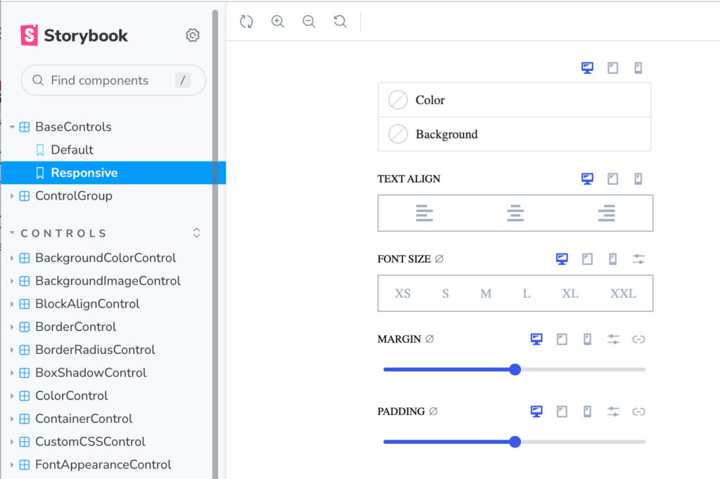
You can add these controls to the blocks of your plugin using the plugin (recommended) or just add the library to your plugin. See GitHub for details.
Responsive blocks are still Gutenberg blocks, so there is a learning curve. If you need help, don’t hesitate to reach out.
We built this plugin to provide responsive blocks for Mindspun Payments. We’re releasing it as a separate project—for free—so that you won’t have to go through the pain we did 😀.
 Mailing Address